Layouts are the backbone of your social media visuals in Marfeel Amplify. They are written in HTML and CSS, and used by Marfeel to automatically generate stunning images for your posts. Whether you’re sharing a breaking news story or promoting a feature article, Layouts ensure your content looks professional and on-brand across all social platforms.
With Layouts, you can:
- Automate image creation: Save time by letting Marfeel generate images for you.
- Customize designs: Tailor Layouts to match your publication’s unique brand style.
- Ensure responsiveness: Layouts adapt seamlessly to different social media formats (e.g., Stories, Posts, Link in Bio).
We recommend working with your design team to define how you want your images to look and customize your Layouts according to your specifications.
Master Amplify, step by step
The video below is an excerpt from the Amplify Fundamentals course.

 Discover more learning paths on Marfeel Academy.
Managing Layouts
Layouts are managed in Amplify > Settings > Layouts. The list includes:
- Name – The layout’s identifier.
- Creator – Who created the layout.
- Format – Whether it is a Post or Link In Bio layout.
- Aspect Ratios – Supported dimensions.
- Enable/Disable Toggle – Controls availability.
If this is your first time using Marfeel Amplify, you will only see pre-configured layout presets to help you get started.
Creating and Cloning Layouts
You can create a layout in two ways:
- New Layout – Click the
New Layoutbutton to build a layout from scratch. - Clone an Existing Layout – Use the three-dot menu next to a layout to duplicate it.
Clicking on a layout row will open the editor, except for Marfeel’s default layouts, which are not editable and can only be cloned.
Enabling and Disabling Layouts
Not every Layout will suit your needs. Use the Enable/Disable toggle to hide Layouts you don’t want your team to use. Only enabled layouts will appear in Marfeel Amplify Account Settings and on the Post Edition screen for selection.
Creating Layouts
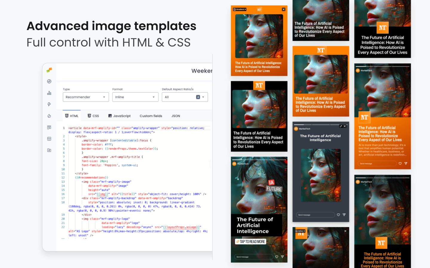
The layout editor provides a code editor and a real-time preview. Changes you make on the former are reflected on the latter instantly.
Marfeel Amplify Layouts use the same system as Experiences Layouts, utilizing the Mustache templating language and the Trimou rendering engine. For more information, see Experiences Layouts.
Type, Format and Aspect Ratio
At the top of the layout editor, dropdowns allow you to configure:
- Type – Must be set to Social for Marfeel Amplify use.
- Format – Either Post or Link In Bio.
- Aspect Ratio (for Post format only) – Defines applicable aspect ratios (e.g., Square, Story, etc.).
Editor tabs
The editor consists of five tabs:
HTML
Defines the structure of the layout and renders the image.
CSS
Contains the styles, inserted into the HTML as a <style> block.
To avoid this, apply a
max-width in ch units to the text element, ensuring predictable wrapping.
JS
Allows for some custom functions such as image main color detection. For advanced and experimental use.
Custom Fields
Just as in in Experiences Layouts, Custom Fields are parameters that allow for reusing the same layout for different circumstances. For instance, the same Layout can be used for different accounts just changing the main color. They will be listed in Marfeel Amplify Account Settings when the Layout is selected as default for that account.
They consist in four properties:
- Name – Displayed in account settings.
- Key – Used for referencing in the code.
- Default – Pre-set value used in the layout preview and account settings.
- Help – Tooltip text explaining the field’s purpose.
Custom Fields can be referenced in code through {{layoutProps.FIELD_KEY}}. For instance:
<img class="logo" src="{{layoutProps.logoImg}}">
There are some reserved Custom Field keys that will inherit default values from Global Settings. They are the following:
- Text Properties:
typographyFamilyName,typographyWeight,typographySize, andtextAlignment - Main color:
color - Logo:
logoImgandlogoAlignment - Image container:
borderRadius - Avatar (for Link in Bio):
avatarImgandavatarAlignment
JSON
This tab contains an example payload to render the preview on the right. Change the values to see how different images and text will look on this Layout.
Using Custom Typographies
- Add the desired font-faces as a Custom CSS global settings:
@font-face {
  font-family: 'Raleway';
  font-style: normal;
  font-weight: 100 900;
  font-display: swap;
  src: url(https://fonts.gstatic.com/s/raleway/v34/1Ptug8zYS_SKggPNyC0IT4ttDfA.woff2) format('woff2');
}
- Add both Normal and Bold font-weight to support bolding on the Image Preview Editor
- For variable fonts you can specify multiple font-weights like
font-weight: 100 900;
- For variable fonts you can specify multiple font-weights like
@font-face {
  font-family: 'Raleway';
  font-style: normal;
  font-weight: 100 900;
  font-display: swap;
  src: url(https://fonts.gstatic.com/s/raleway/v34/1Ptug8zYS_SKggPNyC0IT4ttDfA.woff2) format('woff2');
}
- For Static Fonts you’ll have to declare different font-faces for the different font-weights
@font-face {
    font-family:"barlow-condensed";
    src:url("https://use.typekit.net/af/edeee1/0000000000000000773dbea3/31/l?primer=7cdcb44be4a7db8877ffa5c0007b8dd865b3bbc383831fe2ea177f62257a9191&fvd=n6&v=3") format("woff2");
    font-display:swap;
    font-style:normal;
    font-weight:600;
    font-stretch:normal;
}

@font-face {
  font-family: 'barlow-condensed';
  font-style: normal;
  font-weight: 900;
  font-display: swap;
  src: url(https://fonts.gstatic.com/s/barlowcondensed/v12/HTxwL3I-JCGChYJ8VI-L6OO_au7B45L0z3bWuYMBYro.woff2) format('woff2');
}
Usage of of @import statement is discouraged for perfomance reasons. Make sure to declare only the needed font-faces.
- Use the font-family name declared in the Custom CSS block as the default Typography
Learn how to publish smarter, automate sharing, and optimize your social strategy with our Marfeel Amplify Course.
Workflow-focused training

Start now on Marfeel Academy.