
To make reporting and analysis easier for your teams, every Workspace in Marfeel can be visualized as an interactive, dynamic Dashboard that you can tailor to fit different needs in your organization. Dashboards allow users to have a fully customizable experience on Marfeel, empowering teams to share complete context, dig into the data, and work better together.
Dashboards can be static or dynamic, depending on their users and uses. As their name suggests, static dashboards present a specific picture of your data, while dynamic ones allow you to edit them, changing the timeframe of the data you are viewing and applying filters.
With Marfeel’s dynamic dashboards, you can:
- Apply a date range and/or a set of desired filters to all the reports in your dashboard at the same time.
- Control the size, shape, style, and positioning of all the reports in your dashboard to create a fully customized workspace that presents information in a way your brain best digests it.
- Build dashboards specifically designed with certain teams in mind — for your sports section, your breaking news team, your subscriptions team, etc. — and then share the dashboards with those teams so they are working with the data that matters to them specifically.
This guide will show you how to:
- View your workspaces as dynamic Dashboards
- Adjust the size and shape of your reports
- Access and edit your reports from within the Dashboard
- Customize how your data is visualized
- Apply the same filters and date ranges to all reports at once
- Create visual targets within your reports
- Add notes or instructions to your Workspace
- Learn who has what type of access levels to Dashboards
Bear in mind: Adjustments to workspaces can be done only by owners and co-owners users. In the cases described below, owners will be used as an umbrella term to refer to owners and co-owner. Workspace Viewers cannot make changes to dashboards.
How to view workspaces as Dashboards
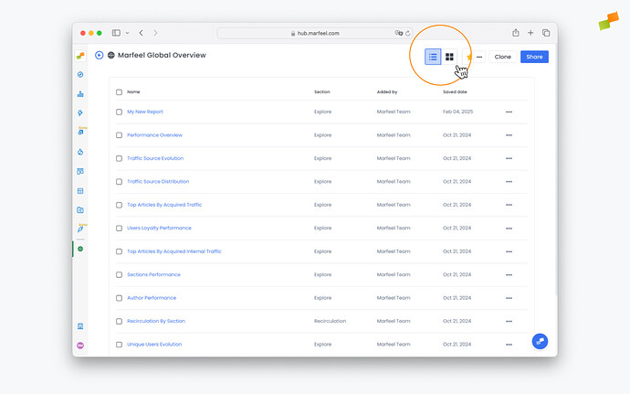
When you access a Workspace, you can easily toggle between a list view showing all the reports it contains, and a dashboard view, which generates a graphic visualization of all the reports together in a single screen.
-
From your workspace, click the dashboard button in the top-right corner to switch to dashboard view:
-
You’ll now be able to see all the reports in the Workspace presented in beautiful dashboard format. You can see reports from Explore, Optimize, Compass, Recirculation, Social Monitoring, Discover Monitoring, and Core Web Vitals all presented visually in your dashboard.
Become a Marfeel Dashboards expert
Learn how to build, customize, and share data-rich dashboards that drive real editorial impact with our Dashboard Fundamentals Course.
Self-paced video lessons
![]() Start now on Marfeel Academy.
Start now on Marfeel Academy.
Adjust size and shape of reports
To adjust the shape and size of the report owners can click and drag on the lower right corner of the report until it fits your desired dimensions.

Access, edit reports
Workspace owners can edit reports clicking on the title of the report. From there, click on pencil icon near the top to change the report’s configuration.
Workspace owners can also change the title of a report contextually from the dashboard view. To do so, click the pencil next to the title, make the changes you want, and click out.
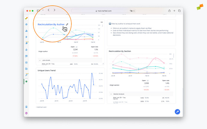
Chart visualizations
Owners can choose what type of visualization they would like to use for their data depending on the types of reports the dashboard contains.
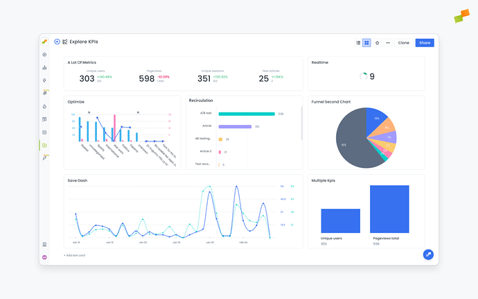
- Timeseries: Great to visualize patterns and trends over time for one metric or any number of metrics.
- Area chart: Ideal for showing how proportions — how much new users vs. loyal users, Google users vs. all other traffic sources — change over time.
- Bar chart: Perfect for a quick volume breakdown or comparison between two time periods.
- KPI: Can be single KPI or multiple KPIs. For Explore reports, these KPIs can show comparisons for metrics between time periods. For Compass reports, these KPIs show predictive analytics that compare the current metric value it to the average of the previous four time periods.
- Funnel chart: Designed for seeing the effiency of things like a conversion funnel, for instance — how many of my registered users become subscribed users?
- Pie chart: An easy-to-read, highly digestible way to visualize your current numbers.
- Comparative: See your desired KPIs with comparative metrics, so you can keep your most important targets top of mind while assessing your reports. Comparative metrics will be displayed if the original report contained a comparison.
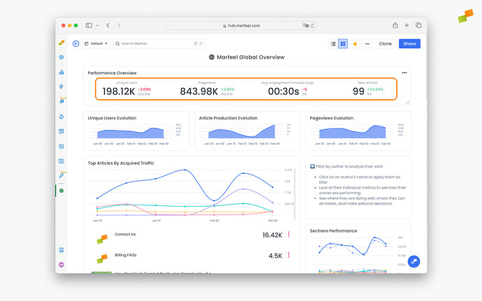
Table Visualizations
In addition to visual graphs as seen above, reports can also be viewed in table format. Workspace owners can select between Table and Article mode by clicking on the ... in the top right corner of a reports and selecting Display as: Table at the bottom of the menu.
Article view allows you to bring in article-level data to give additional context like the Author, Title, publish date or main article KPIs.
Article view is only available when:
- The original report is an Explore or Recirculation report and is broken down by
TitleorURLdimensions. - The original report is a Compass saved report

The primary & secondary metrics of the Article table view respect that order of the metrics available in the saved reports. The first metric becomes the north star.
Static vs Dynamic Dashboards
Dynamic Dashboards allow users to slice and dice the data on a dashboard for exploratory analysis without constraints, while Static Dashboards are guided playbooks on how to look at data preventing users from freely drilling down and exploring further filters and time periods.
To make a dashboard dynamic, owners can set Show filters and / or Show Date picker to Yes. Conversely, to make it static set these fields to No. These settings can be changed after creating the workspace from the settings menu by an Owner or co-Owner of the workspace.

Add targets and annotations to reports
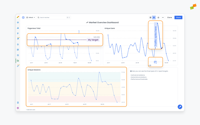
Reports can contain built-in targets and annotations, so everyone using them has additional context and understands the business’s goals and how different metrics relate to them.
-
Vertical annotations: Notes added by users along the X axis of a report, often used to clarify or contextualize important information related to the data it contains. They are bound to a specific date and are usually used to call attention to events that impacted the metrics at a certain point in time.
-
Horizontal annotations: Notes added by users along the Y axis of a report, often used to set targets such as a number of pageviews or a number of articles an author must write, illustrating how the publisher is performing in relation to its goals.
-
Thresholds: Automatically calculated values that determine what constitutes below average, average, and above average performance for given metrics. They are plotted to reports as red, yellow, and green areas and serve to contextualize performance. In addition to automatically calculated thresholds, these can be set manually based on the business’s criteria and objectives.

Targets and annotations can be added to reports from the report page, either when the report is created or by clicking into it and editing it from the dashboard. After adding these and saving the report, they will be visible from the dashboard.
Add notes, instructions to your Workspace
It is possible to add text cards to dashboards to give users additional context and provide guidance on how to read and interpret the reports they contain. To do so, scroll to the bottom of the dashboard, click on Add text card, and a blank text card will appear.

Text can be formatted through a simple dropdown menu within the card, and text cards can be resized and repositioned to provide instructions wherever they are needed.