Marfeel Explore provides built-in calculated metrics to help you quickly extract insights from time series and grouped data.
These metrics are generated by Marfeel, even if the original data comes from an integrated platform.
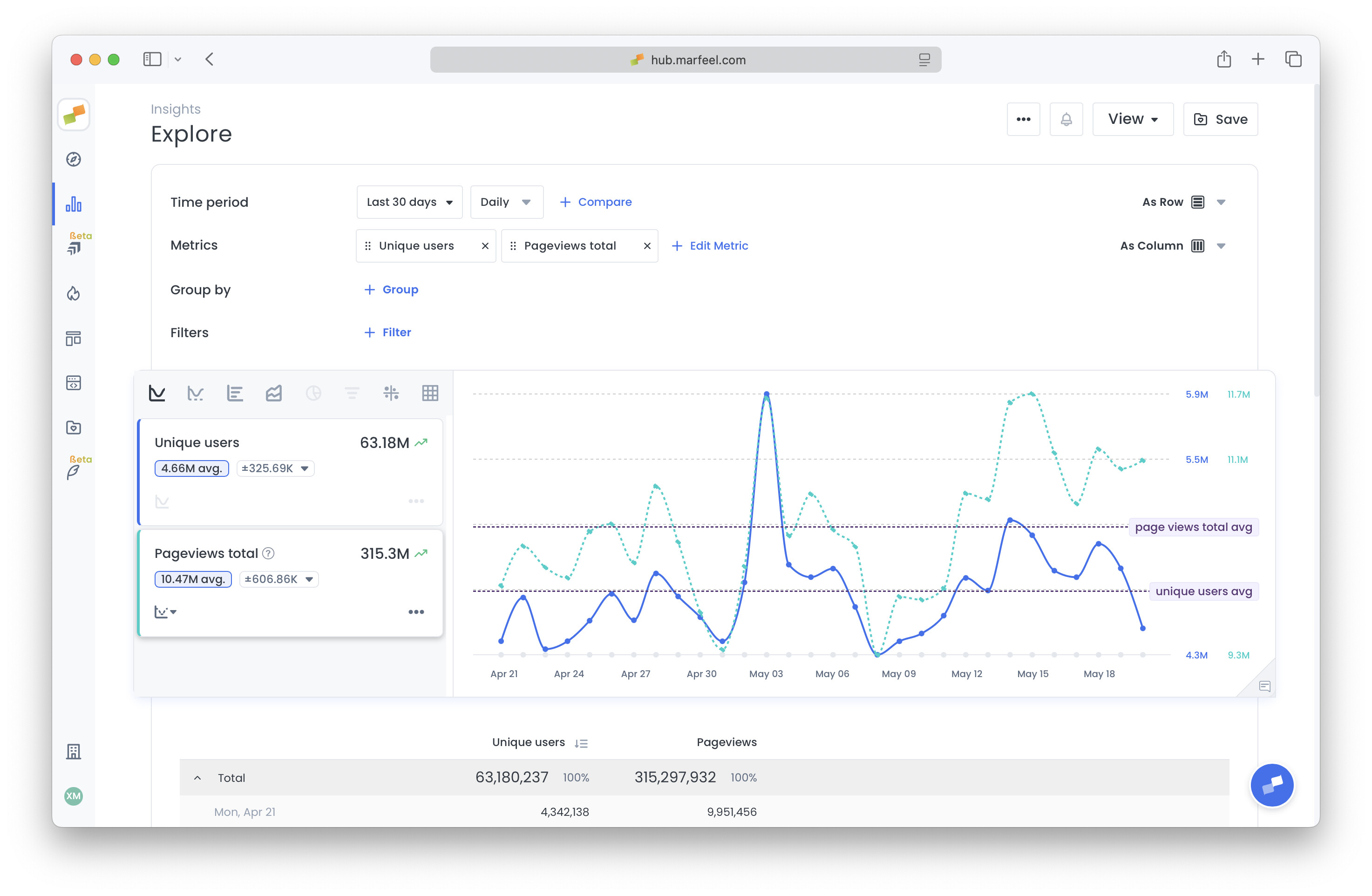
Time Series Average
For time series charts, the average value for the selected period appears below each metric. Clicking the average adds a horizontal annotation to the chart, which you can customize.
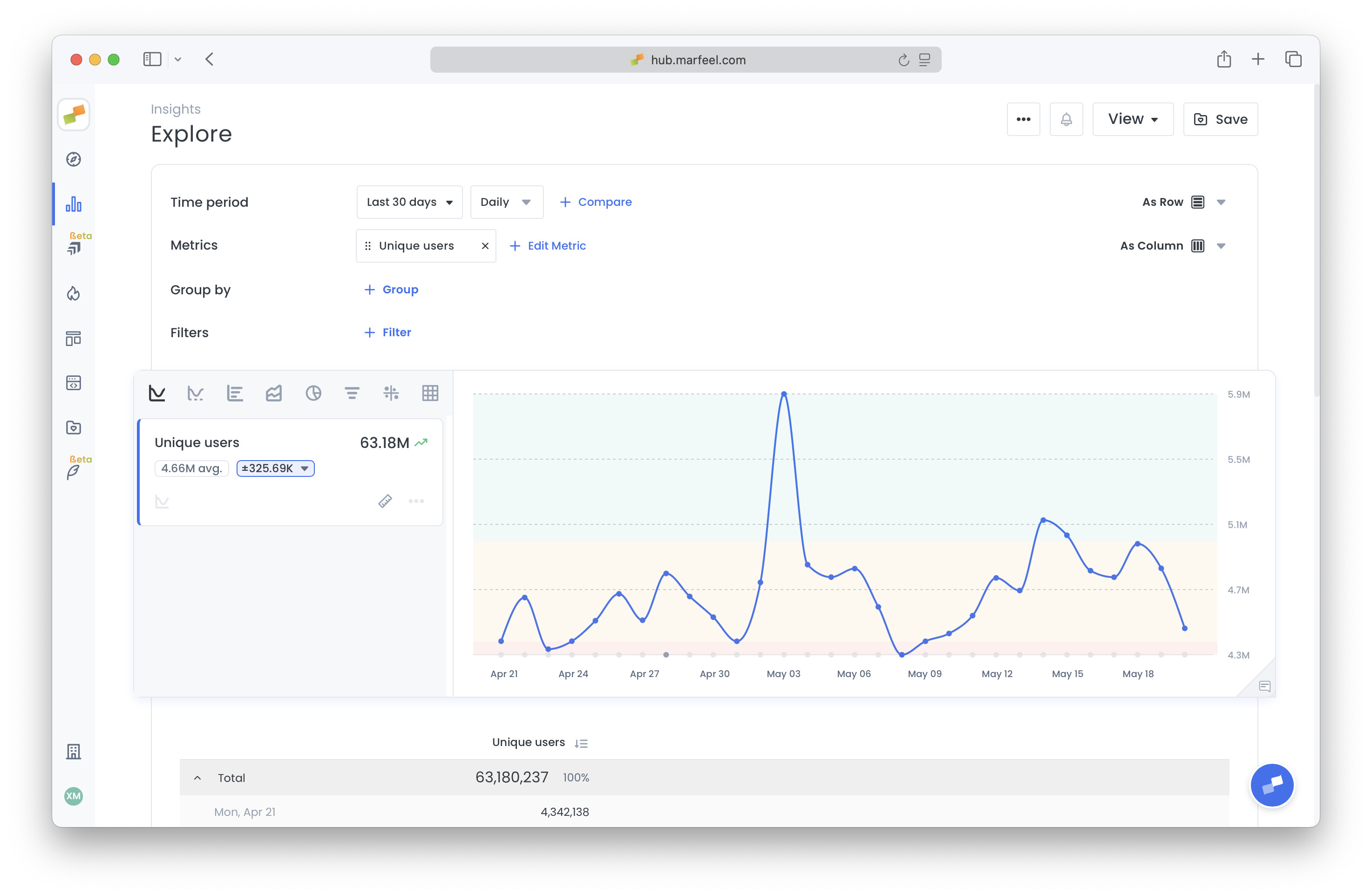
Confidence Ranges
Displayed next to the average, the standard deviation shows how much the metric typically varies from the mean during the selected period. It’s formatted as ±123, indicating typical variation above or below the mean per time bucket. Clicking on it will display confidence ranges as background colors on the chart.
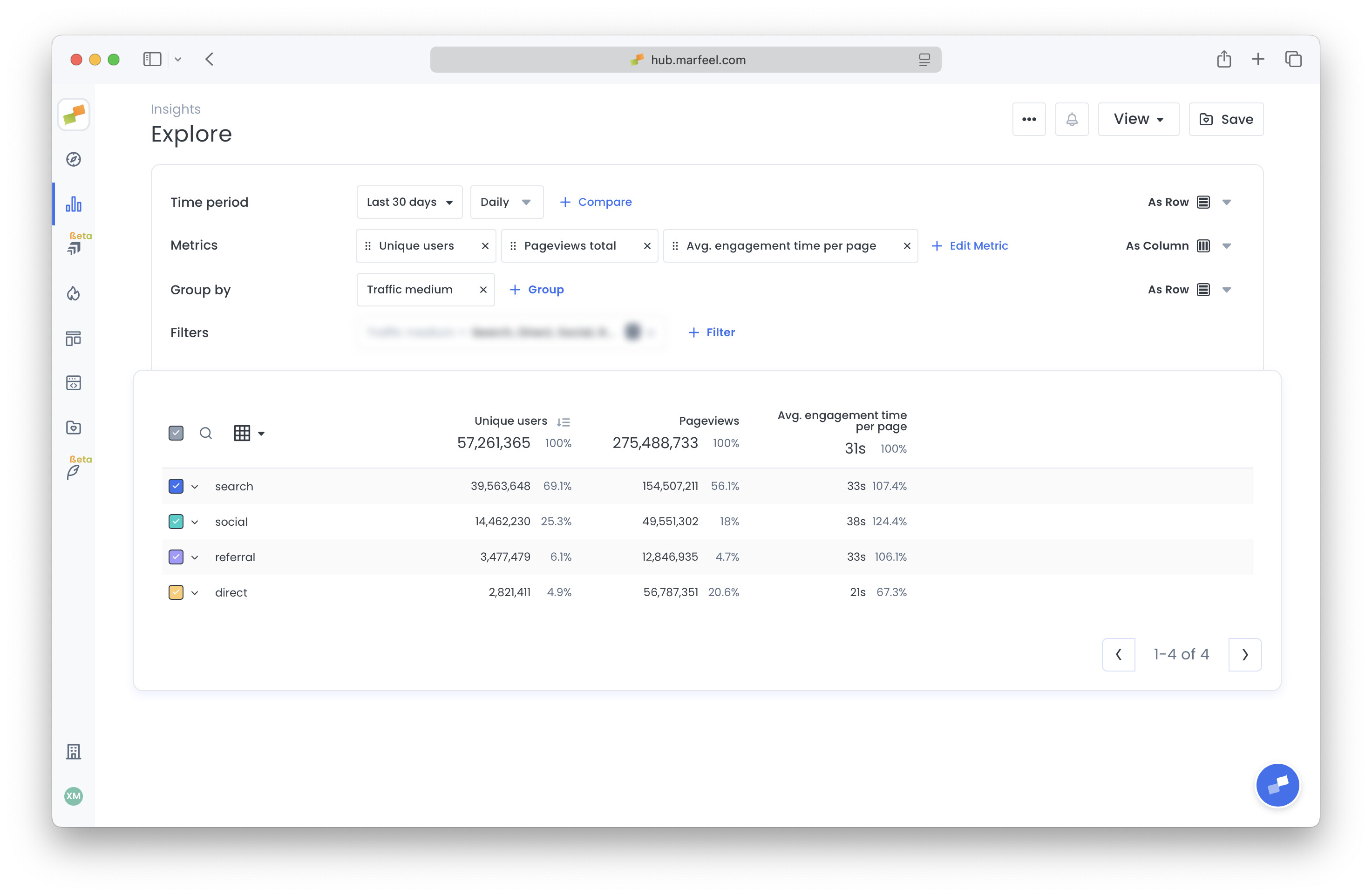
Percentage of total
In the table below the chart, each column includes a percentage next to the main value:
- For absolute metrics (e.g., pageviews), it shows the row’s contribution to the total.
- For rate metrics (e.g., Avg. Engagement Time), it indicates how much the row deviates from the average.