Learn how to use the HUD to make editorial decisions with the right content in the right place. See the Overview for instructions on how to activate or here for troubleshooting ideas. The article on A/B testing includes instructions on how to test headlines and images.
In this article, you’ll find definitions of each of the metrics most relevant to optimizing the home page and using the HUD. These are followed by an explanation of each of the HUD elements, such as the list of articles that generated the most subscriptions and AI-powered headline suggestions.
HUD Metrics
The HUD provides several metrics to allow editors to make agile decisions and find ways to increase engagement. The following metrics serve as the foundation for these types of data-driven decisions and testing.
Viewable CTR
Viewable CTR is the real click-through rate, calculated by dividing the number of clicks on a given link by the number of times the link enters the users’ viewport. After all, a link at the bottom of the page will never garner as many clicks as the top headline. By calculating only the clicks of users who viewed the link, Marfeel makes it possible to compare apples to apples.
Historical CTR
In the context of the HUD, the historical CTR refers to the average viewable CTR for links in the same position during the same four-hour window on the same day of the previous week.
Number of clicks
The number of clicks refers to the total clicks on a given link, or the absolute volume of recirculated traffic going to the link.
Number of subscriptions
In the HUD, subscriptions are attributed to the last editorial hit, meaning the last article read by a user before subscribing. The number of subscriptions can refer to the number of total subscriptions for the publication, the number attributed to articles linked on the home page, or the subscriptions from an individual article.
Time on homepage
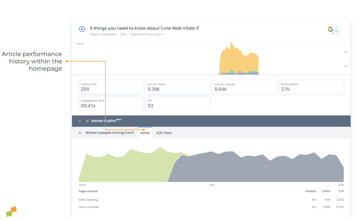
Time on Homepage provides a measurement of the time a specific article has been displayed on the publisher’s homepage, with a breakdown of the different homepage modules where it has appeared and how long it has been features in each of them. This provides at-a-glance visibility of the time a story has been featured on the page and gives homepage editors another useful data point to consider when making optimization decisions about their homepage content.
RFV
RFV is a loyalty score attributed to each individual user based on how often they frequent the site, how recently they did so, and how much content they consume. Users with an RFV over 35 are considered ‘loyal’; those with an RFV over 60 are considered ‘lovers’.
If a story is getting a lot of recirculated traffic from loyal customers, that’s a good indication that the content aligns with the interests of your most valuable readers. It could also be an indication that the article would continue to do well behind a paywall where it would encourage highly-engaged users to subscribe.
HUD Elements
The various elements on the HUD provide editors with the above metrics at a glance. In the case of Viewable CTR and RFV, the HUD also shows how performance compares with the previous week during the same four-hour window.
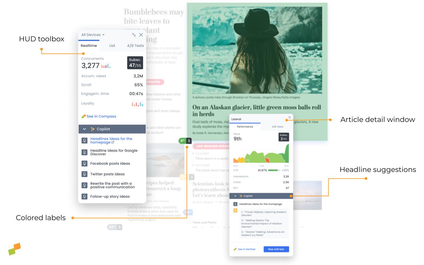
HUD toolbox
The toolbox is a pop-up menu that can be dragged around the screen as you desire. Find answers vis-à-vis the three tabs across the top.
Device type
Expand the drop-down menu in the top-left corner of the toolbox to filter by mobile, desktop, or tablet, or leave as-is to see results for all devices.
Real-time metrics
The first tab provides the following metrics in real time for the page as a whole:
-
Concurrents: the number of current users on the page
-
Subscriptions: the number of subscriptions attributed to articles on the home page vs the publication as a whole
-
Scroll: the average portion of the page the user navigates to before leaving the page
-
Engagement time: the average amount of time the user spends on the page
-
Clicks per minute: The average number of clicks per minute for all positions.
-
Accum. views: the total number of pageviews since 00:00
-
Loyalty: the histogram shows the breakdown of users according to their average RFV
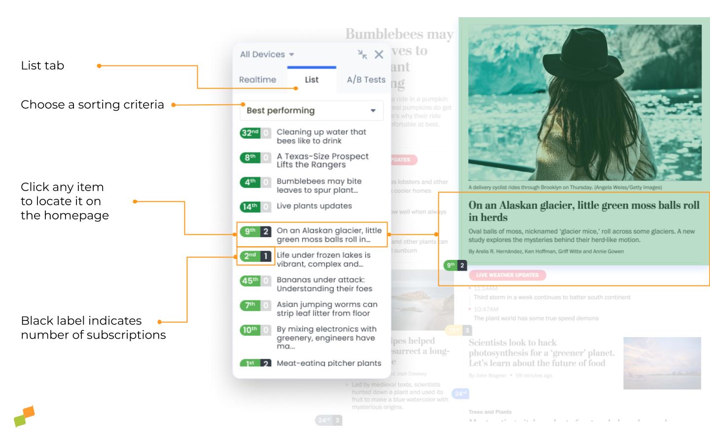
Lists
Choose one of the following lists from the drop-down menu. Click on any of the list items and the page will automatically scroll to the exact location of the link so you can see it in context:
- Most Clicked: orders all the links on the page in order of total number of clicks
- Best performing: orders links by the percentage difference in viewable CTR compared to the historical CTR in order from highest to lowest
- Worst performing: links displayed in order of the percentage difference in viewable CTR compared to the historical CTR in order from lowest to highest
- Most subscriptions: orders links by the number of subscriptions attributed to each article across the entire publication. This includes articles that are not linked on the home page so that editors can give high-converting content more visibility on the home page if they choose.
- Time on homepage: orders homepage articles by the time in minutes/hours they have been displayed on the page. Also includes the ranking of most clicked stories, so you can contrast time on page to performance.
A/B
Access ongoing and archived A/B tests for titles and images. Read more about A/B testing here.
Colored labels
What’s a “good” viewable CTR? Marfeel answers this question by comparing the viewable CTR for the current placement and article position to the viewable CTR for the same placement and position the previous 4 weeks during the same 4-hour window. This is represented by the color of the labels:
- Darkest green: > 150%
- Other greens: 150% – 5%
- Gray: 5% – -5%
- Yellow: -5% – -20%
- Orange: -20% – -50%
- Red: < -50%
- Blue: A/B test in progress
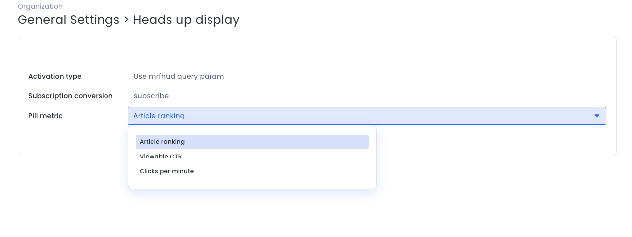
Label Metric
The main colored number on each label can be configurable via HUD Settings to choose which metric to display:
- Article ranking (default value): is equal to the link’s rank in terms of total number of clicks. i.e. An article displaying
2means it’s the 2nd most click article in the page. - Viewable CTR: is the ratio of clicks to the number of times the article is actually displayed and fully visible to users. i.e. An article showing
3%means that it gets 3 clicks for every 100 times it gets visible on the viewport of the user. - Clicks per Minute: quantifies the rate at which users engage with content by clicking on elements. i.e. An article showing
6.7means that it gets 6.7 clicks every minute.
A black number displayed on a colored label indicates the number of subscriptions attributed to that article. Read more about subscriptions on the Heads Up Display here.
Article detail window
Click on any colored label to open the article detail window and explore the elements inside:
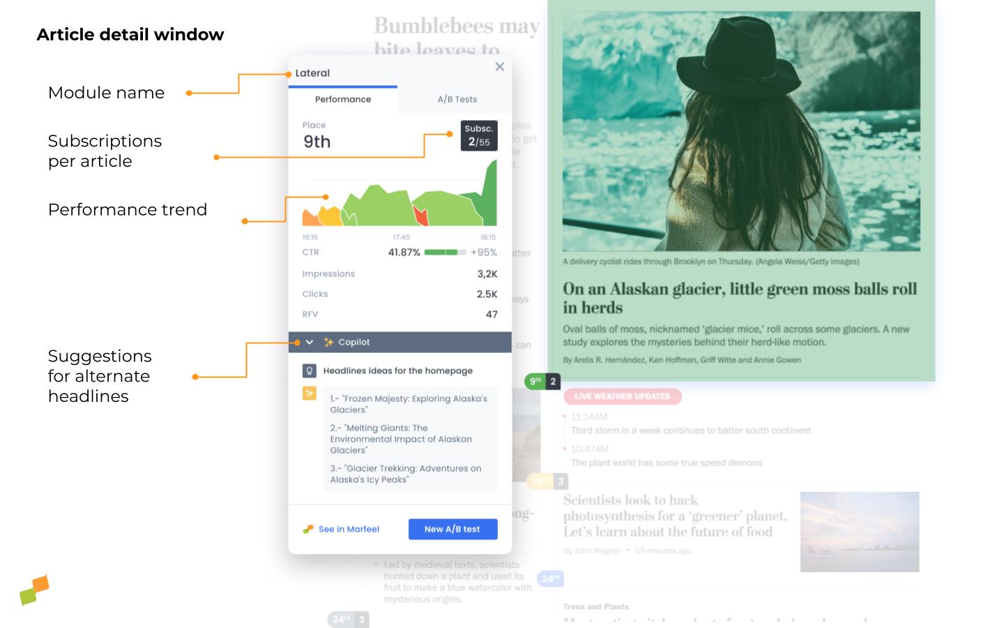
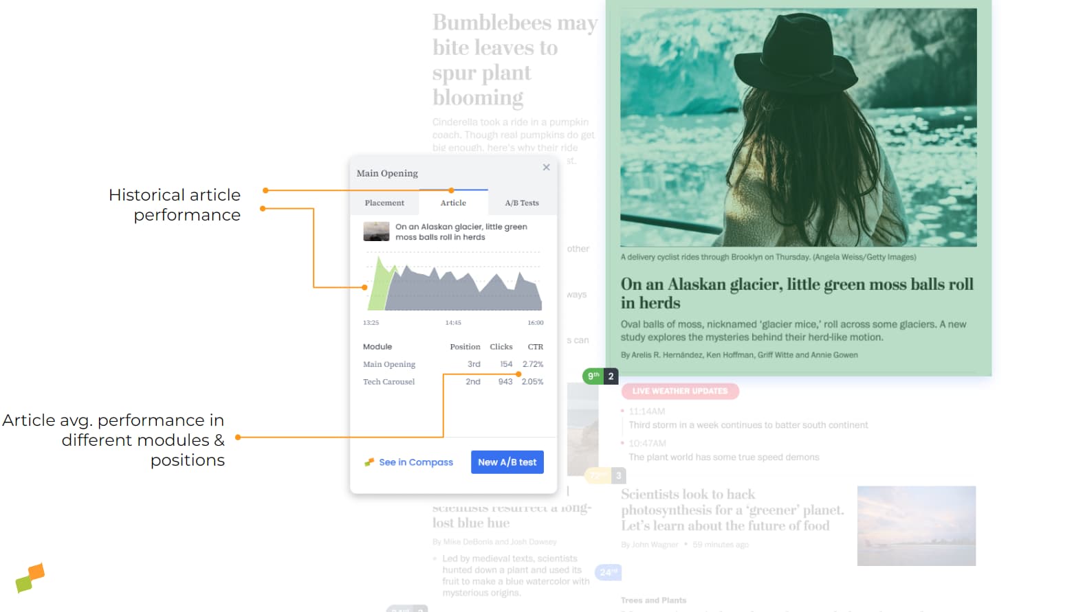
Module name
The module name appears at the top of the article detail window. The module is the region of the homepage that hosts the link, such as “Opening” or “Opinion panel”. This is a recirculation module or “named source” that is set up in the recirculation module by an admin.
Modules are an internal traffic source on the platform, with all related data available at the warehouse level, meaning it’s possible to drill down further into any module to track performance. Learn more about module naming in the No-Code Recirculation Experience guide.
Inside the article detail window, you’ll find two tabs: Performance and A/B tests. Under the performance tab, you’ll find the following elements:
Rank
If a link is ranked first, this means it has the highest total number of clicks compared to every other link on the page.
Subscriptions
The number of subscriptions attributed to the article.
CTR
The link’s viewable CTR and the percentage difference and the historic CTR or the average viewable CTR during the same four-hour window the previous week. The color of the bar is green if the viewable CTR is outperforming the historic CTR and red in the opposite case.
RFV
The link’s average RFV—the average RFV of users that have clicked on the link—and percentage difference compared to the same four-hour window the previous week (the historic RFV)
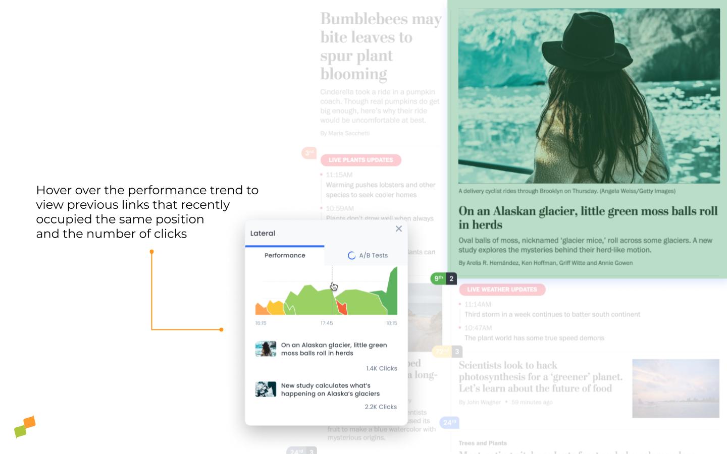
Placement trend
The graph shows the performance trend for links in that same position over the previous three hours. Hover over the graph to see the number of clicks for each of the links that occupied that position during the preceding 4 hours.
Article trend
The graph shows the historical trend of the article’s CTR based on the number of active users viewing the homepage. Especially useful for making decisions regarding which placement is the best when our goal is to maximize the number of clicks on this article.
Homepage article performance
When accessing the item detail in Marfeel Compass, details of the article’s performance are displayed on the homepage according to the position and historical placement it has had in the selected period.
Article trendlines
Some article pills feature small arrows next to them, which indicate the Click-Through Rate (CTR) trend. These arrows help you quickly identify whether the CTR of an article is increasing or decreasing over the past hour. Here’s a breakdown of what you need to know:
-
Direction of Arrows:
- Upward Arrow: Indicates that the CTR of the article is trending upwards (increasing).
- Downward Arrow: Indicates that the CTR of the article is trending downwards (decreasing).
-
Arrow Variations:
- Simple Arrow: Reflects a moderate change in the CTR.
- Double Arrow: Indicates a significant change in the CTR.
Note that only articles with a clear trend over the last hour will display these arrows.
Scroll histogram
This panel provides data on the average behavior of users when scrolling on the analyzed page. This functionality allows some simple use cases:
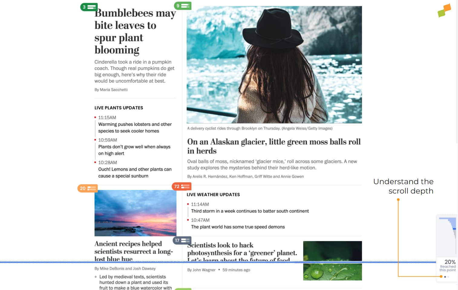
- Detect exit points where users abandon the page in order to be able to analyze if there is any element that produces this effect.
- Study the parts of the page with the highest number of readers, and reinforce that area of the page with strategic elements. For example, adding a video or synthesizing the most valuable information in that area.
- Understand at a specific level the impact of editorial elements that are not being made visible, such as surveys, recirculation elements, a call to action or a multimedia element that has a high importance.

Scroll depth also plays a critical role for home-editors, who need to understand which homepage positions have the most readers in view.
The scroll histogram allows them to analyze in real time where opportunities exist to place pieces that have particular editorial and strategic value.
User-customized panel
Marfeel HUD allows account administrators to customize the experience at the account level in a way that these settings are applied to all homepage editors. However, there are circumstances where different Marfeel users may want to have different perspectives.

Each user can customize the way they view the metrics and data displayed within HUD:
- Devices individually configure the data source based on the device that readers use. Especially useful for managing positions according to the needs of desktop, mobile or tablet users individually.
- Label Metric: Select the metric you want to set for the labels that appear in each position. Article Ranking, Viewable CTR or Clicks per Minute.
- Subscription Conversion: Select the name of the conversion that will be taken into account in the black labels.
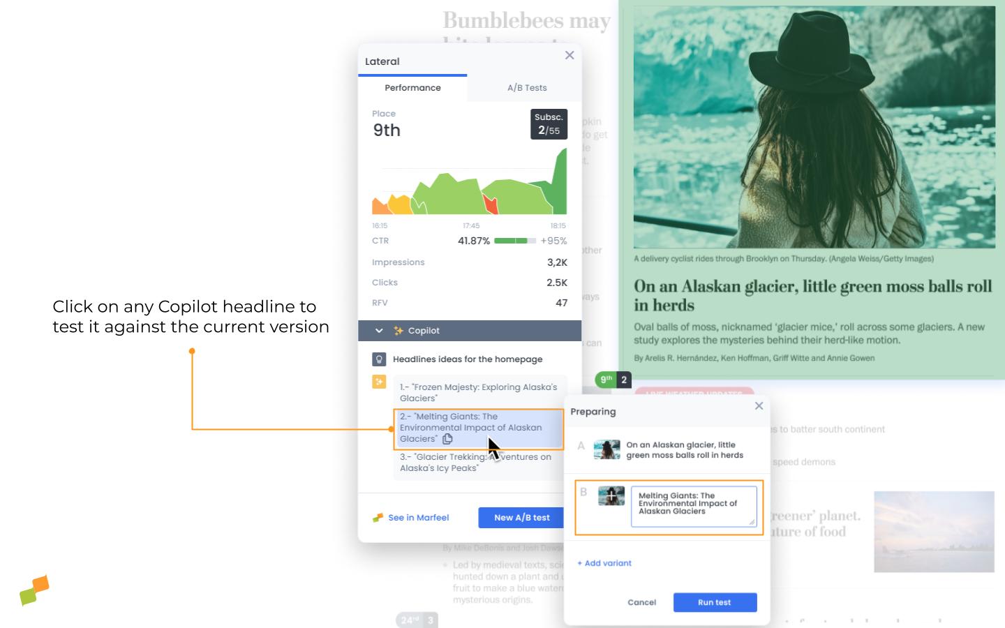
Copilot
Copilot uses AI to provide alternative headlines based on what has previously worked well on the home page. These suggestions are tailored to each publication’s tone of voice because they are based entirely on its own data. Click on any of the headlines to create a new A/B test with that title.
Learn more about A/B testing here.