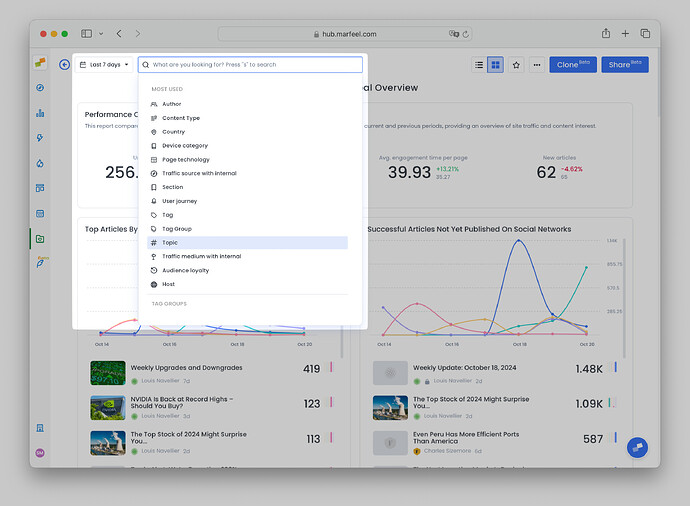
To make reporting and analysis easier for your teams, every Workspace in Marfeel can be visualized as an interactive, dynamic Dashboard that you can tailor to fit different needs in your organization. Dashboards allow users to have a fully customizable experience on Marfeel, empowering teams to share complete context, dig into the data, and work better together.
Dashboards can be static or dynamic, depending on their users and uses. As their name suggests, static dashboards present a specific picture of your data, while dynamic ones allow you to edit them, changing the timeframe of the data you are viewing and applying filters.
With our dynamic dashboards, you can:
- Apply a date range and/or a set of desired filters to all the reports in your dashboard at the same time.
- Control the size, shape, style, and positioning of all the reports in your dashboard to create a fully customized workspace that presents information in a way your brain best digests it.
- Build dashboards specifically designed with certain teams in mind — a sports section, a breaking news team, etc. — and then share the dashboards with those teams so they can have direct access to what you want them analyzing.
This guide will show you how to:
- View your workspaces as dynamic Dashboards
- Adjust the size and shapes of your reports
- Access and edit your reports from within the Dashboard
- Customize how your data is visualized
- Apply the same filters and date ranges to all reports at once
- Add notes or instructions to your Workspace
- Learn who has what type of access levels to Dashboards
How to view workspaces as Dashboards
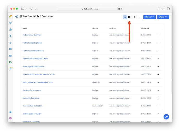
When you access a Workspace, you can easily toggle between a list view showing all the reports it contains, and a dashboard view, which generates a graphic visualization of all the reports together in a single screen.
-
From your workspace, click the dashboard button in the top-right corner to switch to dashboard view:
-
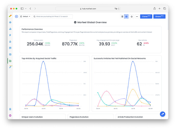
You’ll now be able to see all the reports in the Workspace presented in beautiful dashboard format. You can see reports from Explore, Optimize, Compass, Recirculation, Social Monitoring, Discover Monitoring, and Core Web Vitals all presented visually in your dashboard.
-
If you want, you’ll also be able to see your desired KPIs with comparative analytics presented in the dashboard, so you can keep your most important targets top of mind while assessing your reports.
How to customize your Dashboard
Adjust size and shape of reports
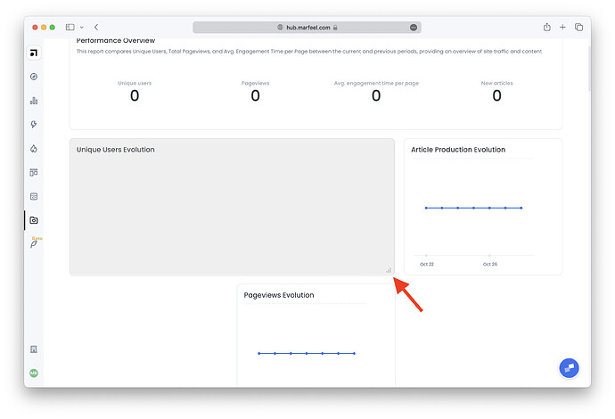
To adjust the shape and size of the report, click and drag on the lower right corner of the report until it fits your desired dimensions.
Pro tip: This feature allows users to compare reports side-by-side in ways not possible before. Want to compare your lists of top-performing stories for
Unique usersandSubscriptionsside-by-side at the same time? Easy. You won’t need to hop back and forth between reports ever again using Dashboards.
Access, edit reports
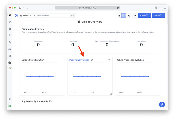
To access the report, simply click on the title of the report. To change the title, just click the pencil icon next to the title. If you want to edit one of the reports, you can do so by clicking through to it, making changes, and saving it.
Choose how you want your data visualized
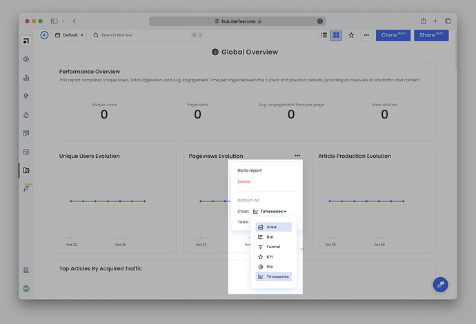
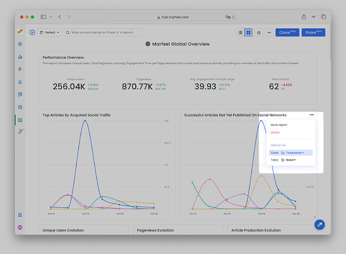
By clicking on the three dots in the top right corner of a report, you’ll be able to select how your data is visualized.
You have the following options to visualize your reports:
- Timeseries
- Great to visualize patterns and trends over time for one metric or any number of metrics.
- Area chart
- Ideal for showing how proportions — how much new users vs. loyal users, Google users vs. all other traffic sources — change over time.
- Bar chart
- Perfect for a quick volume breakdown or comparison between two time periods.
- KPI
- Can be single KPI or multiple KPIs. For Explore reports, these KPIs can show comparisons for metrics between time periods. For Compass reports, these KPIs show predictive analytics that compare the current metric value it to the average of the previous four time periods.
- Funnel chart
- Designed for seeing the effiency of things like a conversion funnel, for instance — how many of my registered users become subscribed users?
- Pie chart
- An easy-to-read, highly digestible way to visualize your current numbers.
- None
You can see the timeseries view and KPI view with a comparison in the screenshot below.
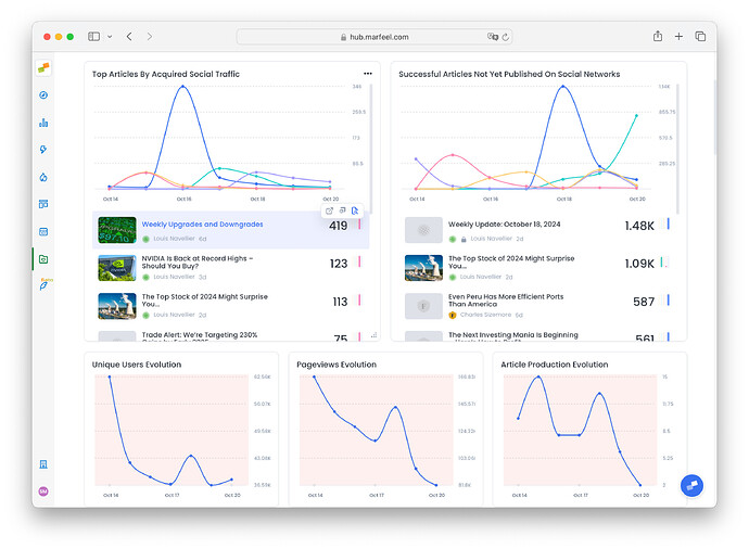
Then, for the table below the chart, you can visualize the data in a table view or in article view, which is much like the real-time story feed you see in Compass. Whatever metric you have selected to rank your content in the original report will also control the ranking in the Dashboard report.
That article view allows you to combine quantitative and qualitative data in a single visualization. It’s important to note the article view supports multiple metrics. So if you add multiple metrics in an Explore report and choose to visualize that report in article view in your Dashboard, all the metrics will appear. In the screenshot below, the report had only one metric.
Apply the same filters, time range to all reports at once
You can also choose filters that will apply to all the data in your dashboard, allowing you to segment and drill down as needed to conduct better analysis. You can choose the timeframe you wish to view and the filters you wish to apply from the top menu buttons.
Add notes, instructions to your Workspace
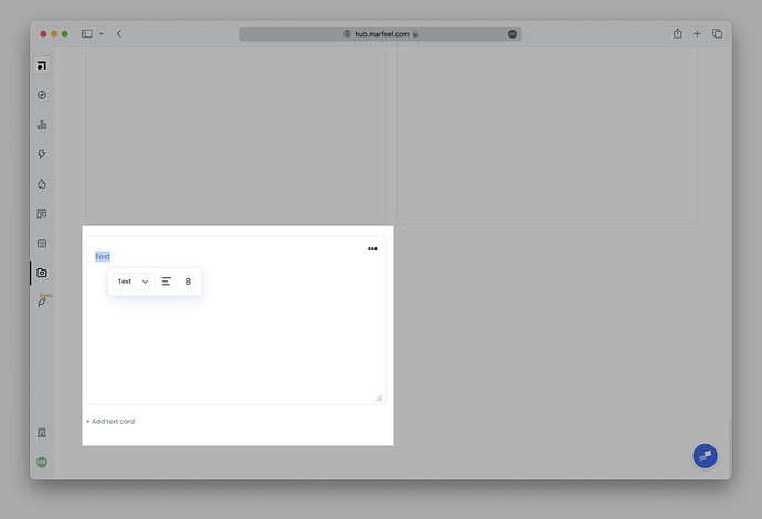
In addition, you can add notes or instructions or any written element to your Workspace by adding a text card. A dropdown menu is included so you can format your text card however you’d like.
Who can edit dashboards?
Creators and Co-owners of workspaces can make the adjustments described above to reprioritize or improve workflow. The changes are applied across all accounts for anyone with access to that dashboard. This makes it easy to align as everyone is looking at the same layout.
Workspace Viewers cannot make changes to dashboards. Learn more about sharing workspaces.
