Layout editing now includes flexible preview options. Users can toggle between visual preview and source code view, switch to fullscreen mode for better visualization, or select from various aspect ratios (Stories, Square, Portrait, Landscape). The source code view displays cleanly formatted HTML for easier inspection and understanding of layout structure.
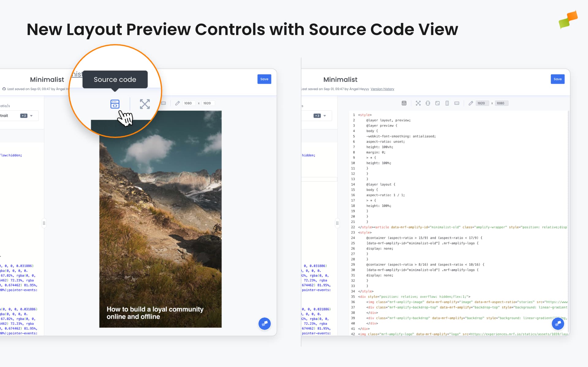
Layout editing becomes more flexible with new preview controls that let you inspect your work from multiple angles.
You can now toggle between rendered preview and formatted source code, switch to fullscreen mode for better visualization, or select from various social media aspect ratios, all from a single toolbar.
What You Can Do
View Source Code: Click the source code icon to see the formatted HTML behind your layout. The code is automatically indented and structured for easy reading, making it simple to understand how your layout is built or troubleshoot issues.
Fullscreen Preview: Switch to fullscreen mode to see your layout without aspect ratio constraints. This is particularly useful for web layouts and experiences that need to adapt to different screen sizes.
Quick Aspect Ratio Switching: For social media layouts, toggle between Stories (9:16), Square (1:1), Portrait (4:5), and Landscape (16:9) formats, or define custom dimensions to match specific platform requirements.
The preview controls are organized with visual separators to group related options, and custom dimension inputs are automatically disabled when in fullscreen or source code view to prevent confusion.
Real-World Use Cases
Technical Review: Inspect the generated HTML to verify structure, identify optimization opportunities, or share code details with developers without leaving the editor.
Cross-Format Design: Quickly preview how a social media layout adapts across different aspect ratios before publishing to multiple platforms.
Layout Debugging: Switch to source code view to understand why a layout renders in a specific way or to verify that dynamic content placeholders are correctly positioned.
Presentations: Use fullscreen mode to showcase layouts at full size during reviews or demonstrations, providing a clearer picture of the final result.
The controls are always visible in the preview panel, making it easy to switch between views as you work. Whether you are building social posts or web experiences, the right preview mode is just one click away.