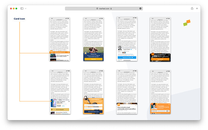
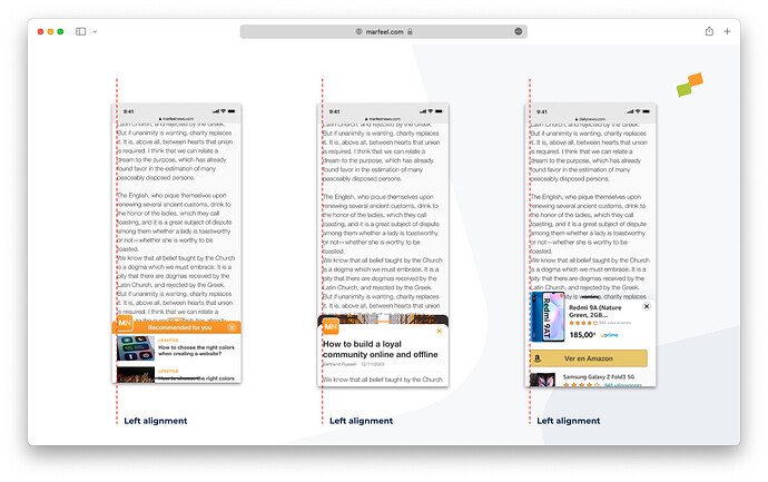
The design system of a Marfeel Experience offers a molecule called Card Icon which overflows on top of the card content and the hero image.
The Card icon molecule can be used for a myriad of purposes including branding, product placement and seasonal announcements or offers.
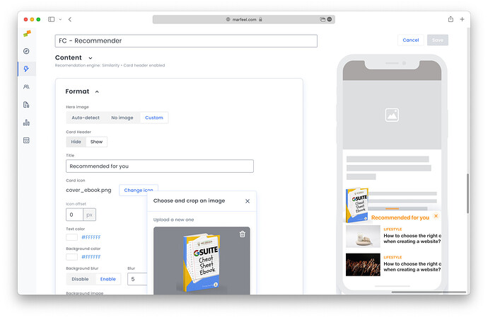
An important use case is to brand the Flowcard with the publisher logo and colors to prevent eye blindness. To ease the creation of branded Flowcards Marfeel Experience Manager includes an icon builder that allows users to upload, tweak and reuse icons.
Icon builder
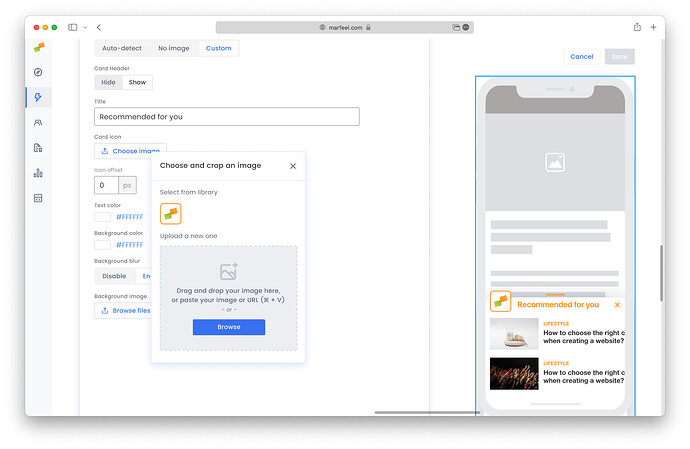
Users can create an icon:
- Copying an pasting an image on their local file system
- Drag’n’ dropping an image from their local file system
- Pasting an image or a url of an image from the clipboard
- Reusing an image already in use in another Flowcard
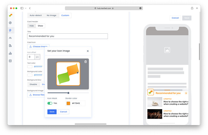
Once an image is selected you can:
- Mask the image with consistent rounded corners
- Add a colorful or transparent border to contrast the brand and the header bar
- Zoom in and out the image
- Pan the image around center what matters
Where can you get an image to get started?
The Card Icon has been conceptualized in a way that existing assets can be reused. It’s strange having to create a ad-hoc new asset or icon for a Flowcard.
Here’s a list of assets you can potentially re-use to get your card icon started.
Twitter, Facebook or LinkedIn profile pictures
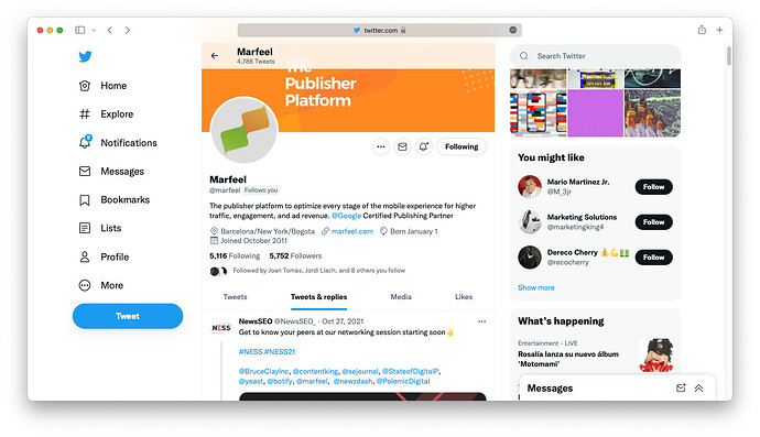
It’s normally a good idea to use social network profile images of the organization since they have square dimensions and works out of the box.
Right click on the profile image and copy the image or the url and paste it in the Icon builder.
Favicon
Almost all webs nowadays host a favicon that can be found on https://domain.com/favicon.ico. If the it has enough resolution it’s normally a good choice.
PWA iOS icons
Lots of sites include the apple-touch-icon link rel to specify an icon for iOS devices. This icon always has the right proportions and resolution.
manifest.json
Last but not least if your site offers a PWA it has a manifes.json file:
This manifest.json file contains a full set of re-usable icons:
Anatomy of an ideal card icon
Marfeel Experience Manager philosophy and vision is to allow users create nice by default and consistent looking experiences. The card icon and the icon builder are important building blocks to achieve it but there are some visual aspects they can’t still control.
- Left margin alignment. To keep visual integrity the icon and the flowcard content must be perfectly aligned to the left. To achieve it you can tweak your content via a Content Transformation both for single articles and for article lists or homepages.
