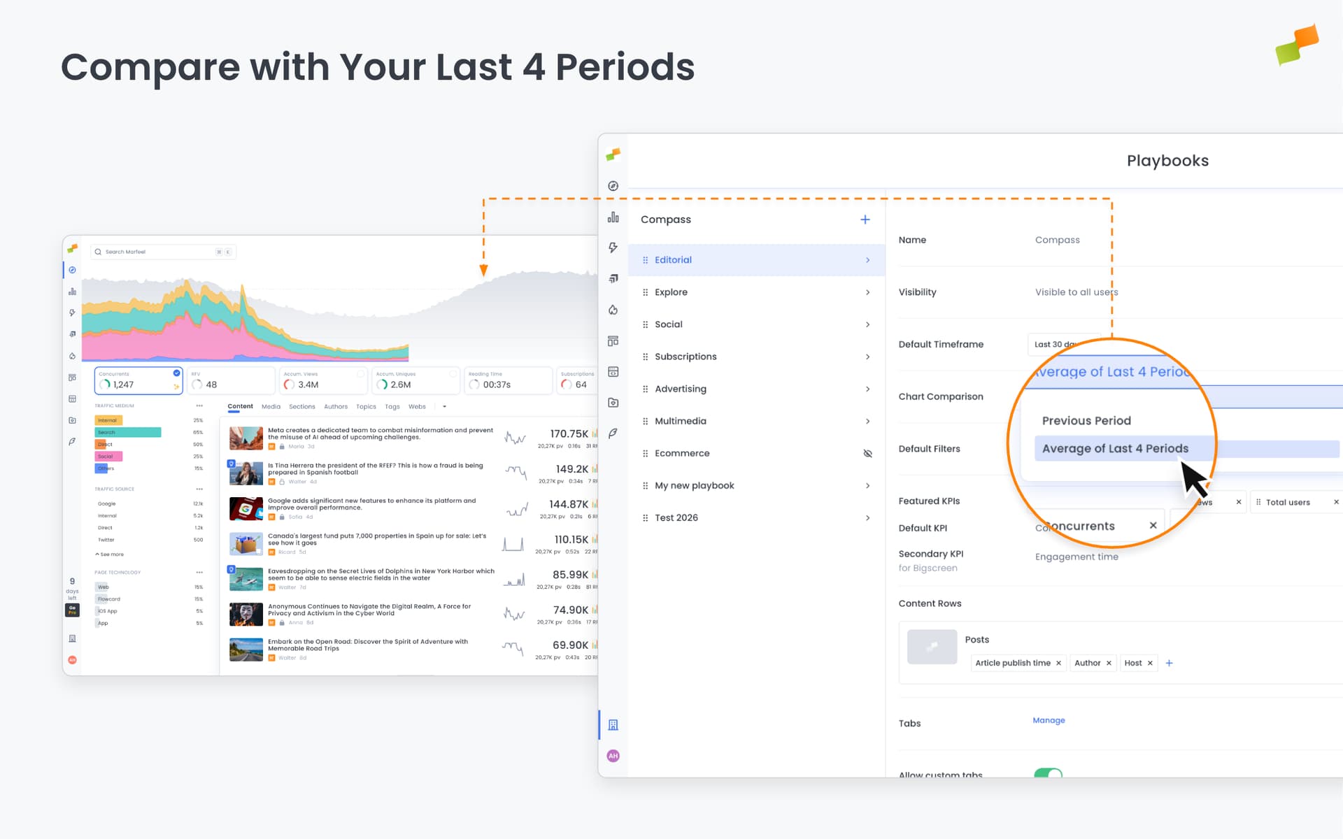
In the real-time Compass chart, the gray comparison area can now show the average of your last four identical weekdays, not just last week.
Today is Monday. Until now, the gray baseline behind your live data showed last Monday. Now, you can choose to see the average of your last four Mondays instead.
Why two options?
Last week’s same day works well most of the time. But sometimes last Monday was unusual. A traffic spike from breaking news, a holiday dip, or an algorithm shift. A single-week comparison can be misleading.
The four-week average smooths out those anomalies. It gives you a more stable baseline when you suspect last week wasn’t representative.
Here’s how you can get started:
- Use the new
Chart Comparissonoption on General Settings > Compass to change it to all users - Use the
Customizeoption on any Compass Dashboard to change it only for your current board.
The gray area updates to reflect your selection
When to use which:
- Last week: Quick pulse check, typical week-over-week analysis
- 4-week average: When last week was unusual, or when you want a more normalized view
Both options are valid. This just gives you more flexibility to choose the right baseline for the question you’re asking.
Happy analyzing!