A day in the life of an editor can be hectic, but the right data helps in key decision making and keeps everyone on track to achieve their goals. Hence, we’ve created this Quick Start Guide, which is meant to accompany editors throughout their day as they learn to apply and master the essential functions of Marfeel.
Many editors apply top-down mental models to calibrate and benchmark the performance of their stories, following these steps:
- How is the publication doing today as a whole? Check the pulse. Is today a good or bad day?
- How are my sections performing? Are they outperforming the rest of the site, lagging behind, or in step with today’s overall trends?
- How are my articles doing? Is any particular story gaining traction? Are my articles performing as well as the rest of the ones in their section?
- Identify article optimization opportunities based on what the data is telling me about their performance.
- How was yesterday? Which articles should I let die? Which ones should I revive with a content refresh?
1. How’s the site doing today?
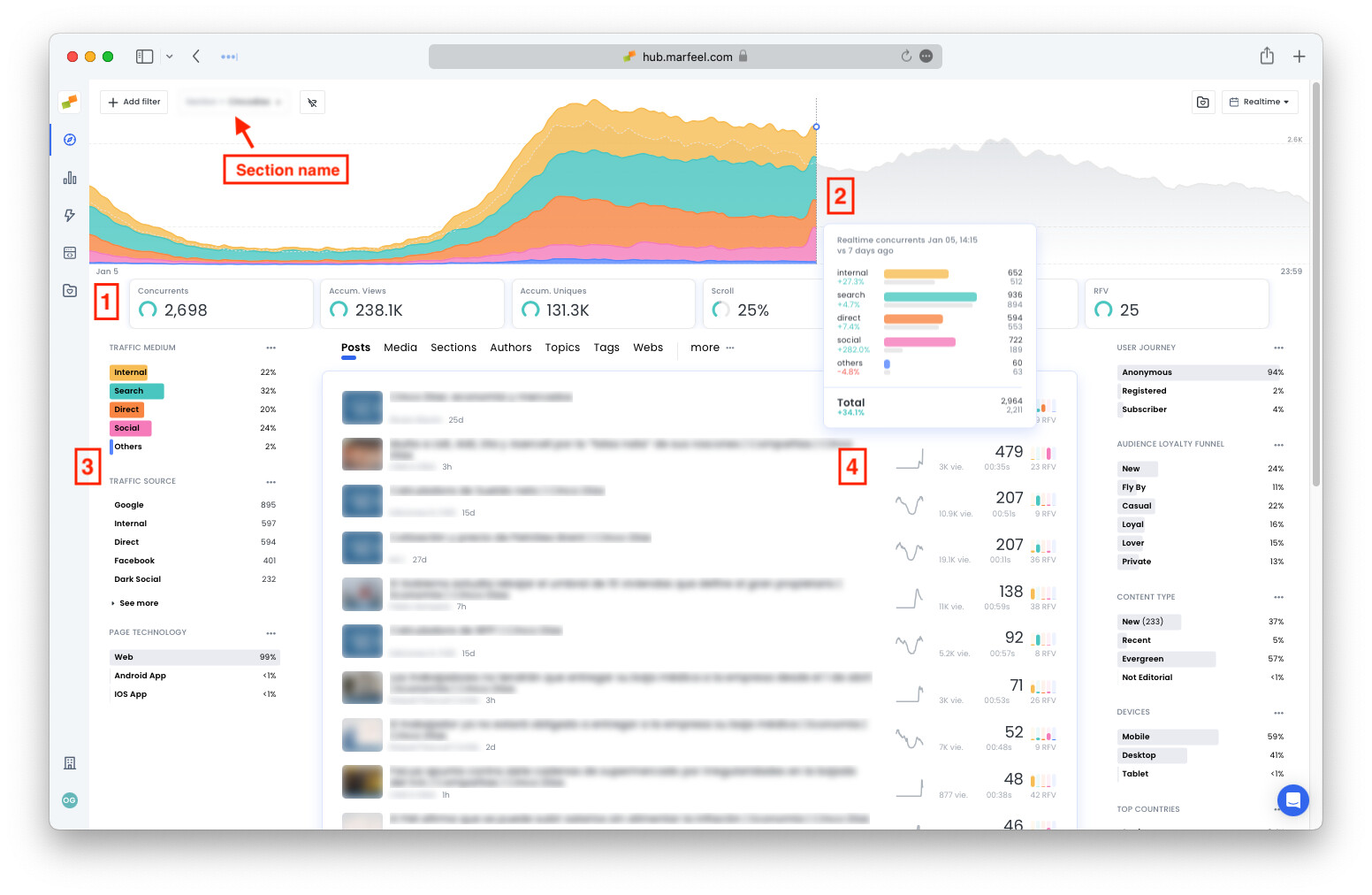
The Compass Dashboard shows you the traffic on your site in real time both on desktop and mobile. This up-to-date information tells you exactly where to go.
Before you even click on anything, you can see at a glance how the publication is doing and how that compares to past performance. Here’s how:
Take a look at the Featured KPIs displayed across the top of the dashboard. The curved bar to the left of each number indicates whether the publication is performing above or below average as compared to the same time on the same day of the week over the past four weeks.
So, if you open the dashboard at 1:06 PM on a Thursday, and the bar next to Concurrents is green, that means that you have more users than the average amount for 1:06 PM on the past four Thursdays. If the bar is yellow or red, then that metric is performing below or severely below average.
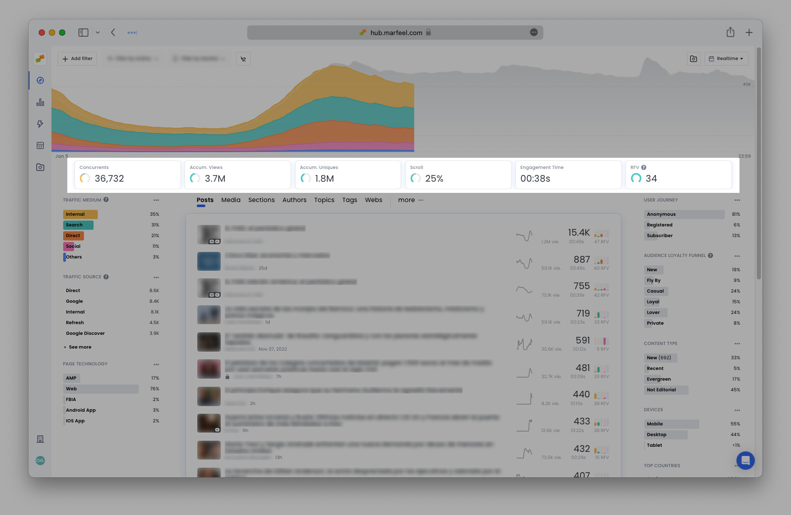
As you can see in the example above, Concurrents is performing below average, whereas all the other metrics are performing close to or above average.
Later the same day, the traffic for the same site improved and even surpassed the average of the last four Thursdays at 5:30 PM. In the meantime, however, the accumulated number of pageviews dropped below expectations:
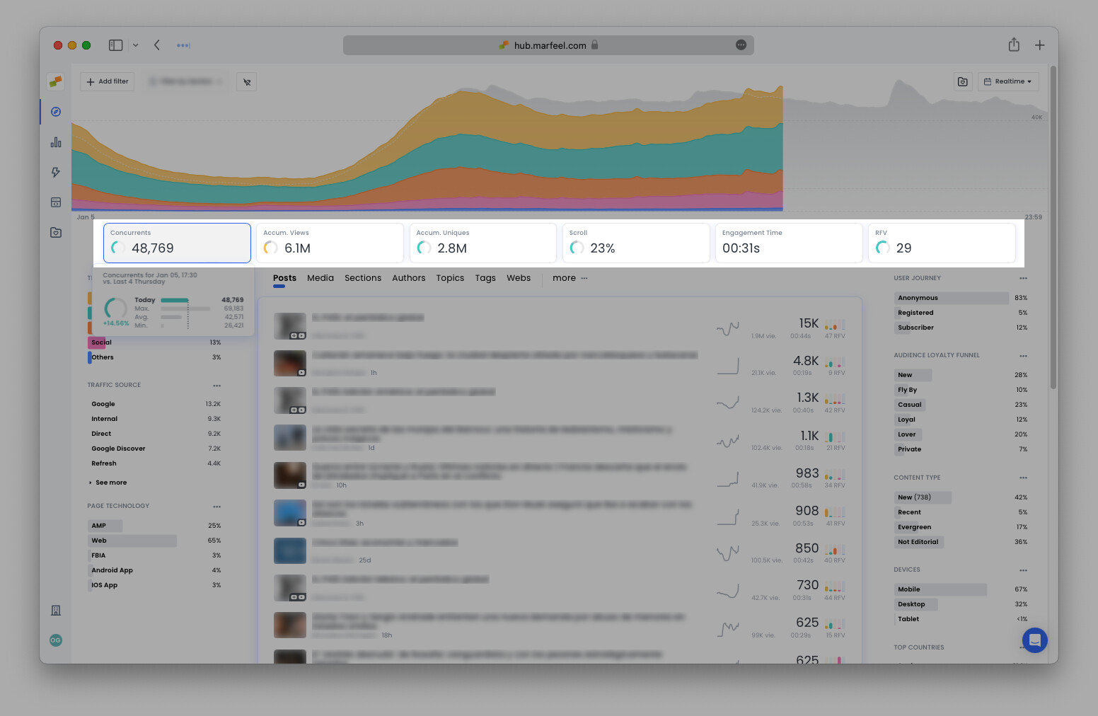
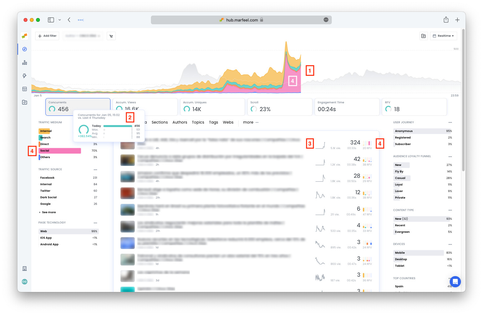
Hover over any of the Featured KPIs to reveal the percentage difference between the real-time metric and the average, as well as information from the past four days of the week:
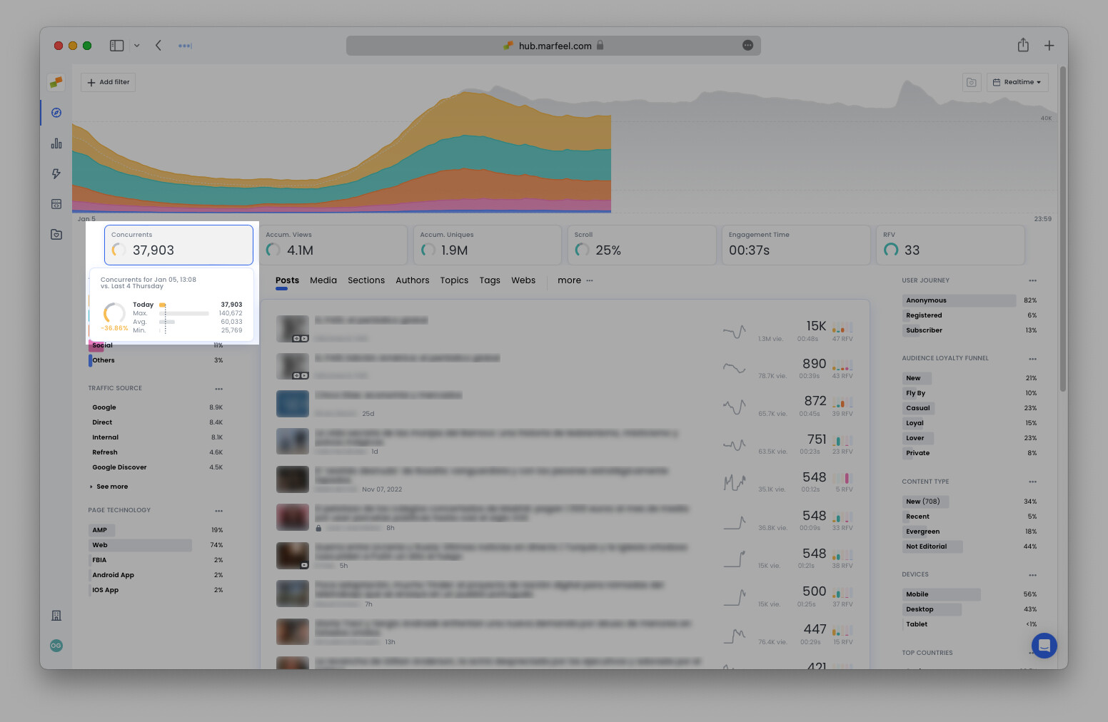
- Today: shows the total for the current minute
- Max: the highest total amount reached at the same time of the day on any of the previous four Thursdays
- Averg: the average number across the four Thursdays in question
- Min: the lowest number for this same time on any of the past four Thursdays
When comparing site traffic across different days, it's important to take into consideration weekday seasonality. Sunday traffic is very different from Wednesday traffic. This is why Marfeel provides comparisons to the same days of the week, and also takes into consideration outliers like bank holidays.
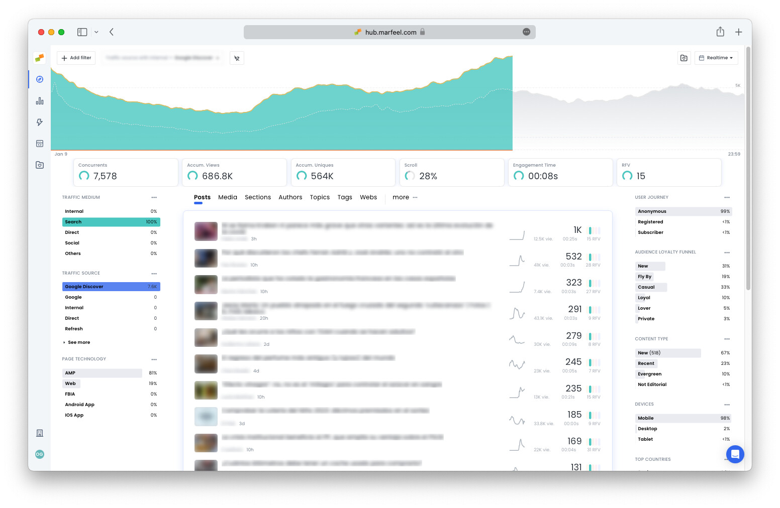
Where are readers coming from? Traffic source and medium
Traffic mediums are the broad categories that describe the origins of your site’s traffic. Traffic sources are the specific points of origin. For instance, the traffic medium Social would include the traffic sources Facebook, Twitter or Instagram.
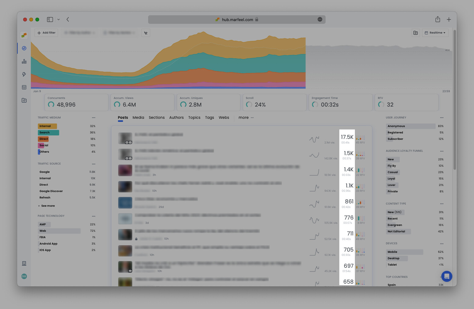
The graph at the top of the dashboard shows the day’s concurrent users, with the different bands representing the breakdown by traffic medium.
The gray shadow in the background represents the graph from 7 days previous, maintaining weekly seasonality at top of mind. Hover over the graph for a precise breakdown of where concurrent users are coming from compared to the previous week:
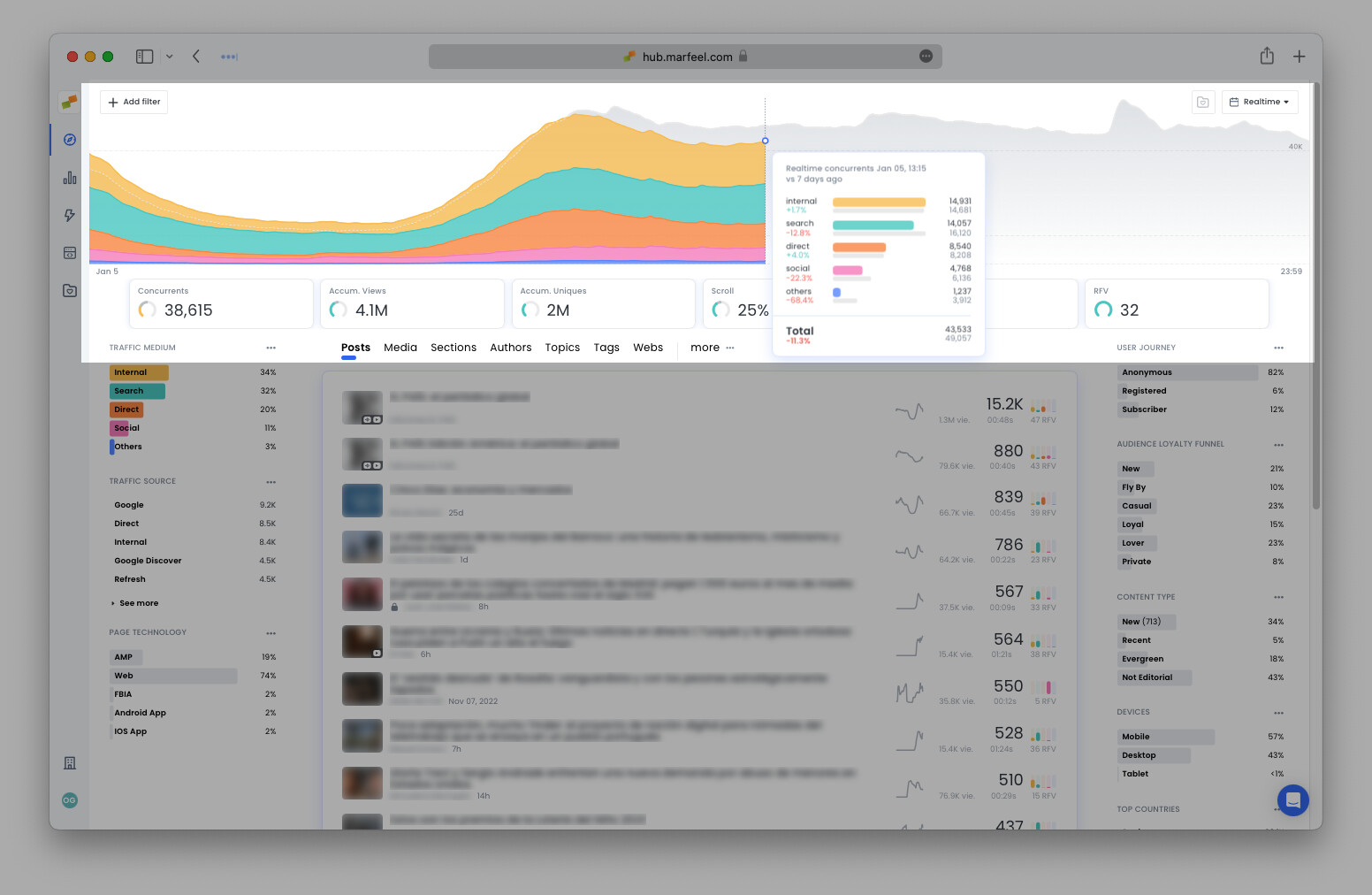
The traffic mediums and sources can also be found in the side panels on the left of the dashboard. There, you’ll find the real-time percentage for each traffic medium and the absolute quantity of concurrent users attributed to each traffic source. To filter the data by a specific traffic medium or source, such as Google Discover:
- Click on any of traffic mediums or sources faceted filters in the side panels
- Click on
+ Add filterin the top-left corner
The second option allows you to filter traffic with internal to include the traffic that has recirculated, i.e. visitors that have clicked through to additional pages. Internal traffic is an important indicator of how engaged readers are with your content. Read more about article recirculation.
In this filtered view, the Featured KPIs update to exclusively reflect the data on concurrent users attributable to Google Discover. It also changes the predictive values accordingly.
Which articles are bringing in the most traffic?
Is traffic evenly distributed across various articles or are certain stories soaring past the rest? If so, why? Perhaps the article is gaining traffic via Google Discover? Or could it be due to recirculated traffic via the homepage? With Marfeel, there’s no guesswork involved. Answer these questions and more with a quick glance at the concurrent users per article, highlighted below:
-
The sparkline demonstrates the life-cycle of a story: which are being born, dying, and the ones that have been revived successfully. An article that is losing traffic might need an update or extra love to keep it relevant. For example: if a topic is trending but you see that your article on that topic is dying, quickly step in (timing is of the essence here), and write a new article regarding that topic for it to keep gaining traction. The sparkline graphic respects the selected filters.
-
The histogram shows the breakdown of concurrent users by traffic medium. An article taking off with a prominent green bar (for Search) indicates that people are finding the article via a search engine or Google Discover. An article displaying a yellow bar (for Internal) probably owes its success to its positioning on the home page.
-
A padlock indicates that the article is behind a paywall. Naturally, these articles have less traffic than ones that are open to the public:
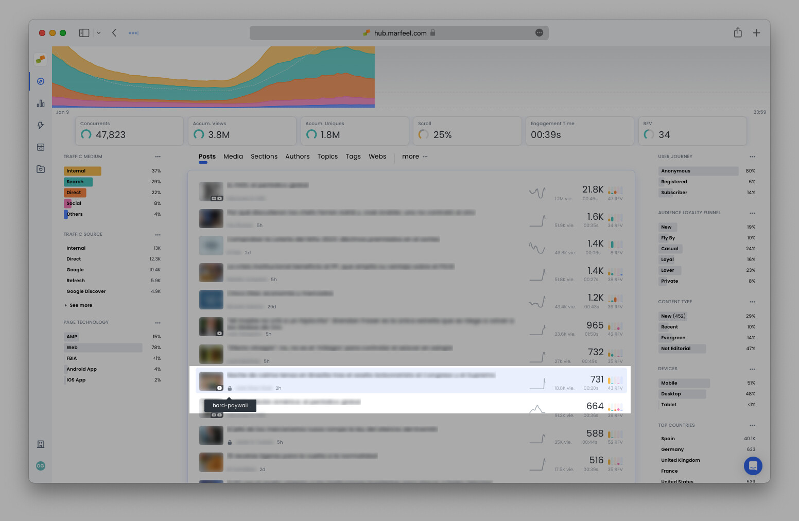
Strategy at a glance: an open article with high amounts of internal traffic (as shown by the accompanying histogram) might be a good candidate to place behind the paywall to encourage recirculating readers to subscribe.
2. How are my sections doing?
Now that you have a sense of how the publication is doing as a whole, it’s time to get a bit more specific and see how individual sections are performing.
Select Sections from the top bar over the middle column. Here you can see at a glance whether or or not the traffic is evenly distributed, or if one particular section is leading the pack.
Hover over the section you want to check and click on the funnel icon or Filter by button to find out why the section is performing at the level that it is.
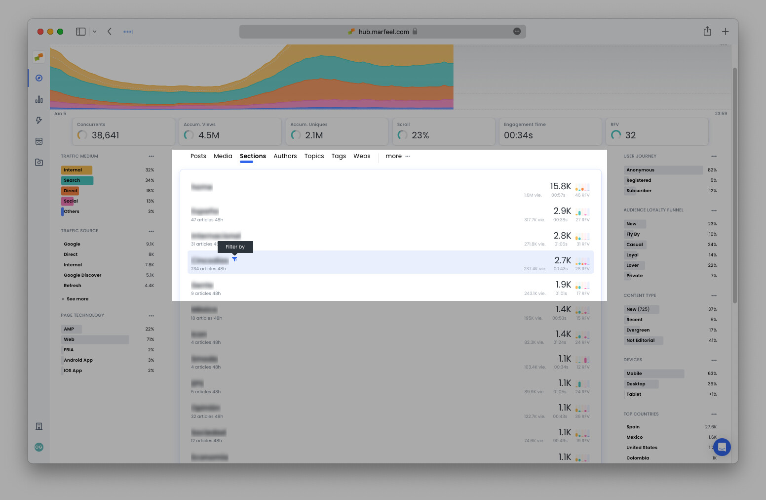
Filtering by section reveals the same performance metrics as we previously saw for the publication as a whole, but on a smaller scale particular to that section.
Do the section trends mirror those of the rest of the site? Find the same elements explained above for each article in the section:
- Number of concurrent users (and the rest of the Featured KPIs)
- Traffic compared to 7 days prior (on the graph)
- Traffic mediums and sources
- Sparklines and histograms for all articles in the section
3. How are my articles performing?
Now that you have a sense for the various sections, it’s time to check up on your stories. Pull up the articles you’ve written by selecting your name from the list of authors and clicking Filter by or click the + Add Filter button in the top-left corner to search.
Once again, we see all the same elements as before, but this time they’re representing one author’s overall performance. In the example below, it’s immediately clear that:
- The author has significantly more readers than last week
- and than the month’s average (an increase of nearly 383%).
- This is in large part due to a particular article that is gaining traction,
- which readers are accessing primarily via social media.
4. How can I optimize my articles?
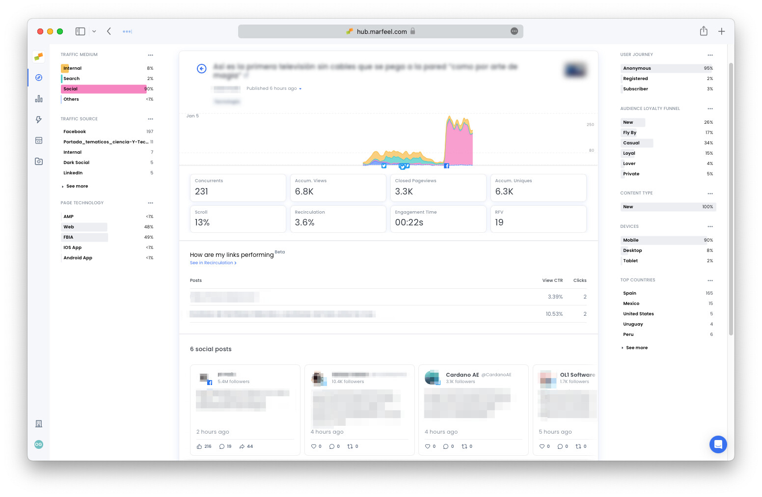
Click on any article to open up the article details. Once again, we see featured KPIs and the graph showing the ebbs and flows of traffic. In addition, there social media and recirculation modules that offer a wealth of data about the article to help the author develop an optimization strategy.
Engagement time per article
One of the most interesting metrics in terms of article optimization is engagement time. Marfeel is able to tell you precisely how much time users spend actually engaging with content. Unlike the more common reading duration metric found elsewhere, engagement time shows you how much time readers really focus on your article. For a lighter piece, times between 15 to 40 seconds are very common, whereas longer-form pieces might after a couple of minutes of engagement time.
Distribution on social networks
In the case of this article, the graph shows that the traffic is coming primarily from social media. Not only that, we can see that a dramatic increase in traffic coincided with a facebook post just after 3 PM.
Below, in the social posts module appear you can find the mentions of your article on social media, as well as the number of likes, comments, and shares each post received. Make sure the Marfeel Social module is setup.
Article recirculation
It’s not only about acquiring users to read an article — it’s also about getting them to have longer sessions and read more articles.
The article details view allows authors the opportunity to optimize links within the article and within the related article modules. The Recirculation rate, at the top of the article view, provides the total number of clicks on links divided by the number of users that see them. It effectively allows editors to understand which internal and external links users are clicking the most.
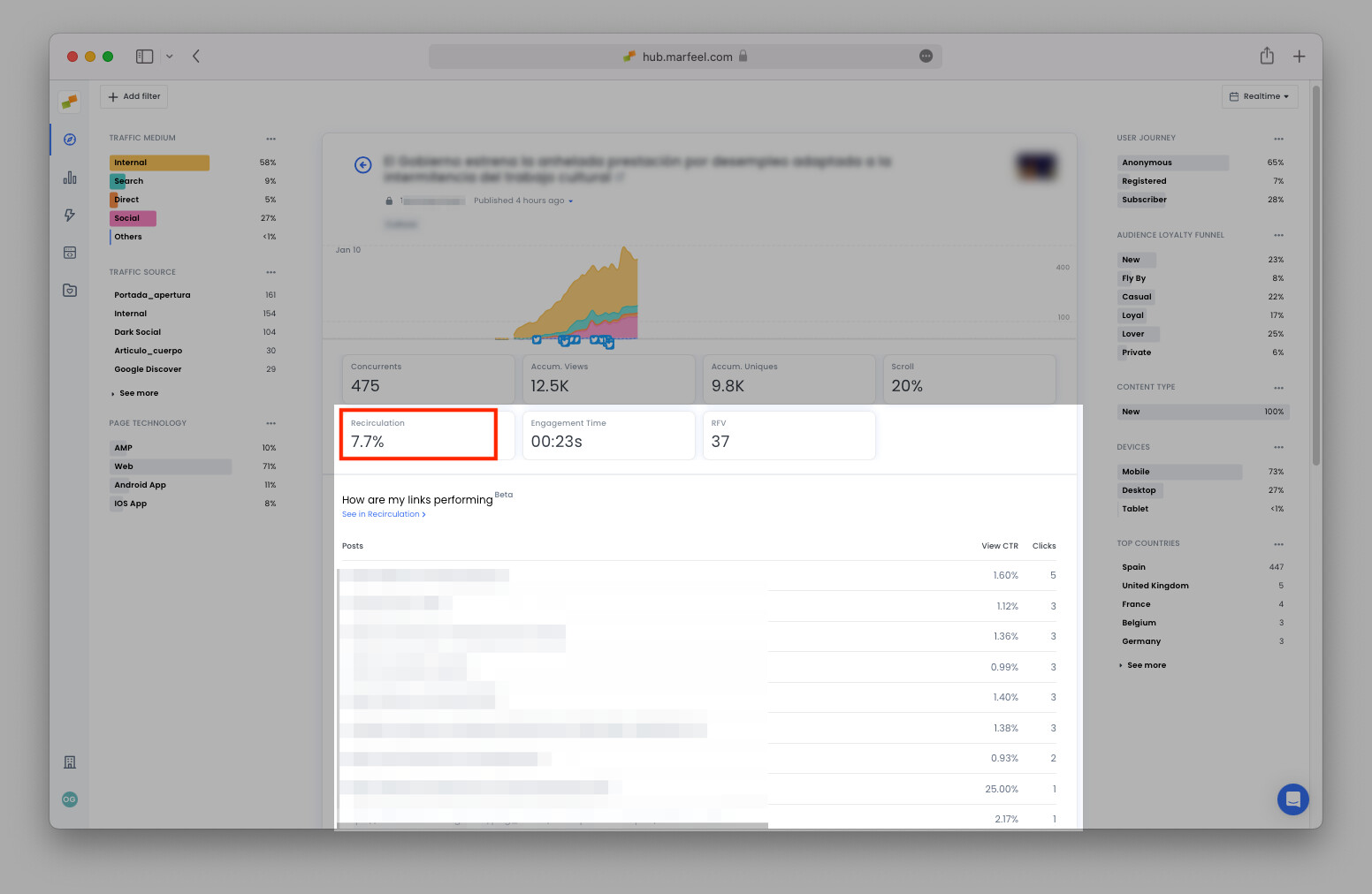
Below that, you have the total clicks per link as well as the Viewable CTR, the real click through rate, which divides the number of clicks divided by the number of users who have scrolled far enough in the viewport to see it.
If a link has a high Viewable CTR but few clicks, for instance, there’s an opportunity to move it up the page to increase its visibility. Read more about article recirculation here.
5. How was yesterday?
Follow up on yesterday’s optimizations to find out which of the above strategies worked. See which articles from the day before are worth saving. One way to access yesterday’s results is to toggle from real-time data to historical from the dropdown menu in the top-right corner.
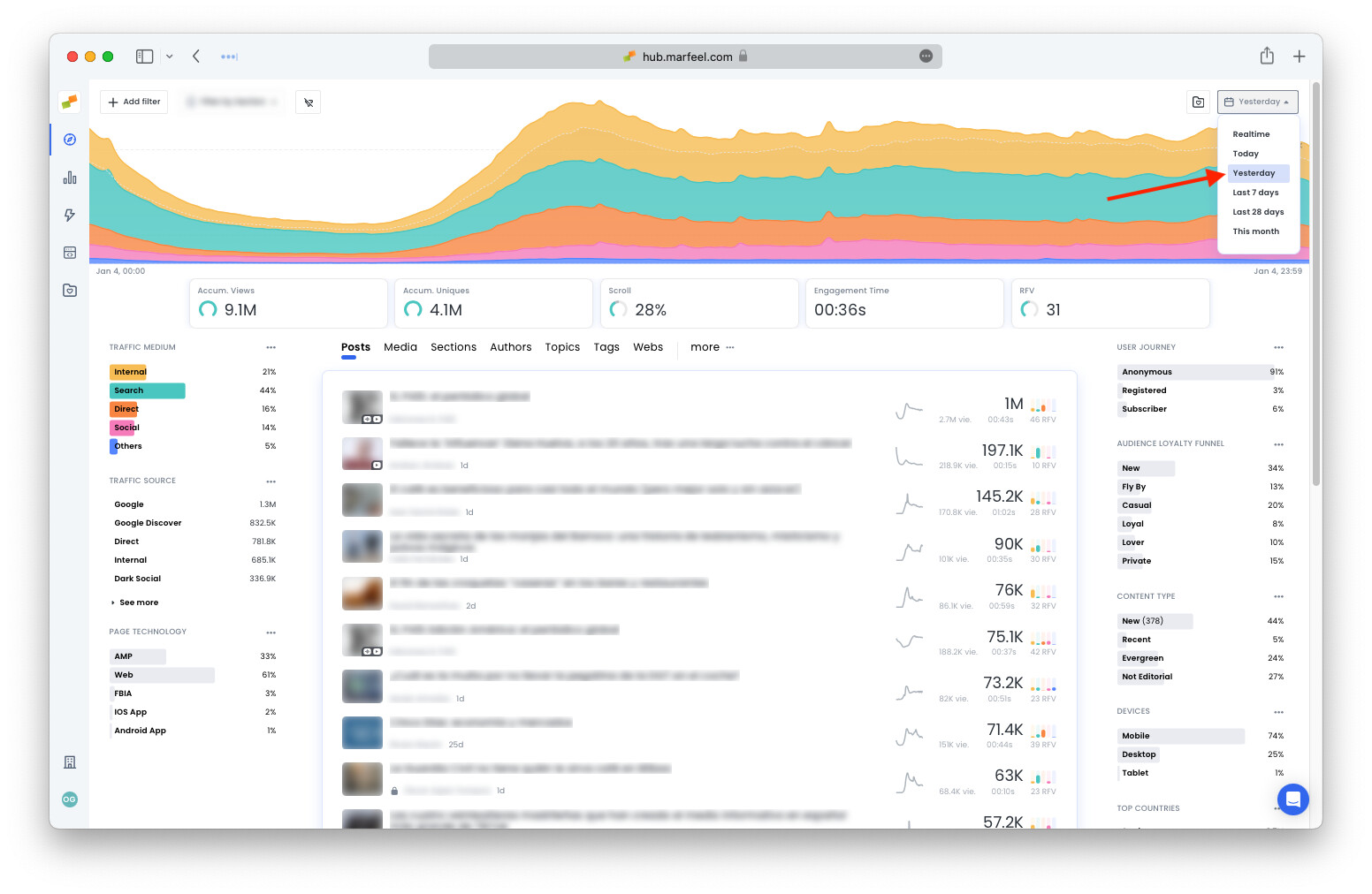
Here, check the sparklines on different articles to see which have the most potential to be revived with continuing content.
What happened yesterday is so relevant, in fact, that we developed a special view called Good morning that you can access from the sidebar. You’ll also receive the Good Morning Report in the form of a daily email.
The Good Morning playbook, available to all users, points out the highlights, what worked, and what didn’t the previous day. It summarizes the findings from yesterday and presents them in a way that’s easy to digest.
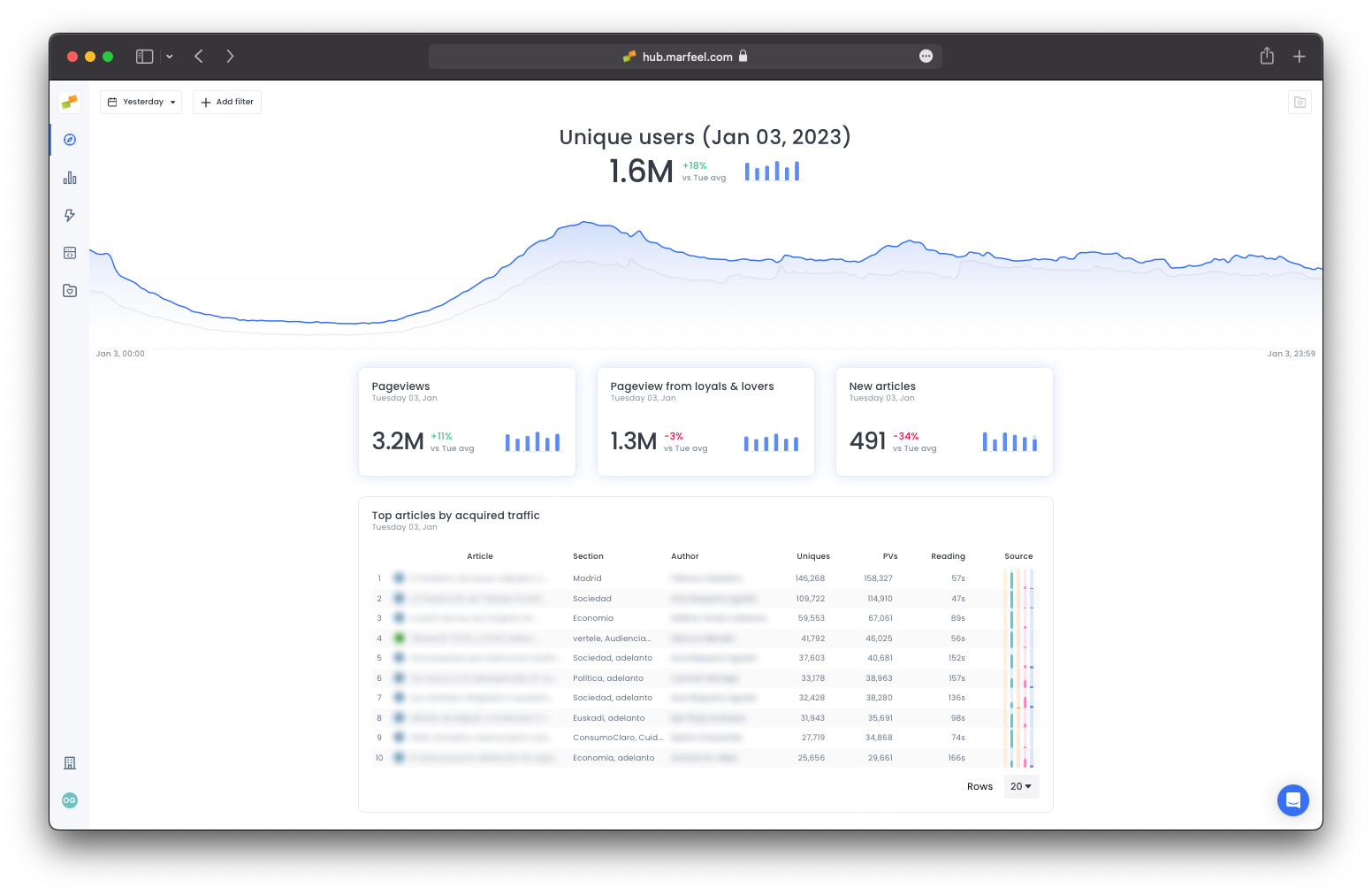
At a glance, see the total number of pageviews, the number of pageviews from the most loyal readers, and the number of new articles published.
See the Top 20 articles that:
- Acquired the most traffic
- Had the most pageviews
- The most subscriptions
- Any other data you add using the same filters found in Compass
6. How can I stay up to date while on the go?
You’re done for the day, and can head home. Maybe you’ll be out of office for a while traveling for work or pleasure. The good news is, you don’t need to be tied to your desk in order to keep track of what’s happening. Marfeel can be installed as a PWA (Progressive Web Application) on Desktop, Smartphone or Tablet. Installing Marfeel as a PWA will:
- Maximize the available space on-screen by removing the browser bars and distractions. Ideal for small monitors, video-wall or big screen mode.
- Install it as a native application to your home screen or desktop to always have it handy.
Find installation instructions for iOS and Android here.